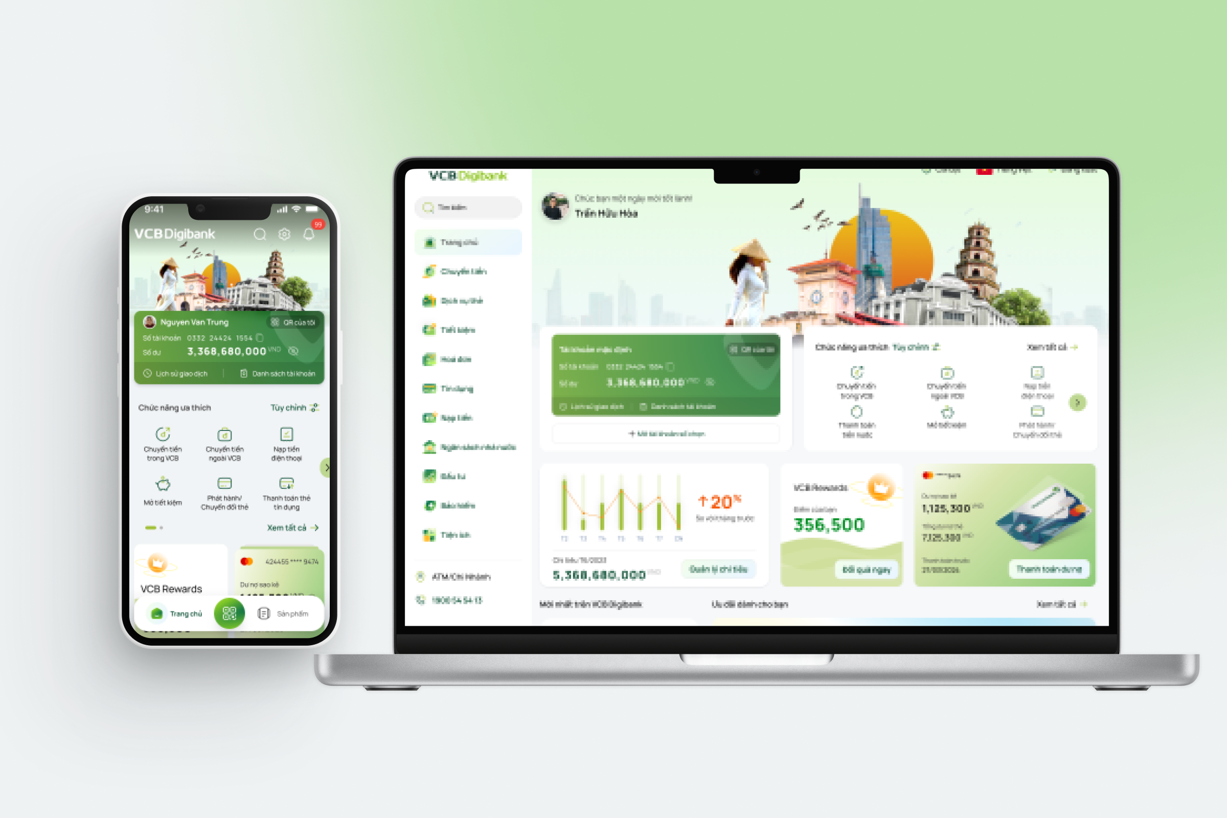
VCB Digibank
The top public bank in Vietnam is trying to revamp their Digital banking application.I and the FPT team used User Research and Industry Study Trend and created Design concept, Information Architect, User Flow and create both Native & Responsive .
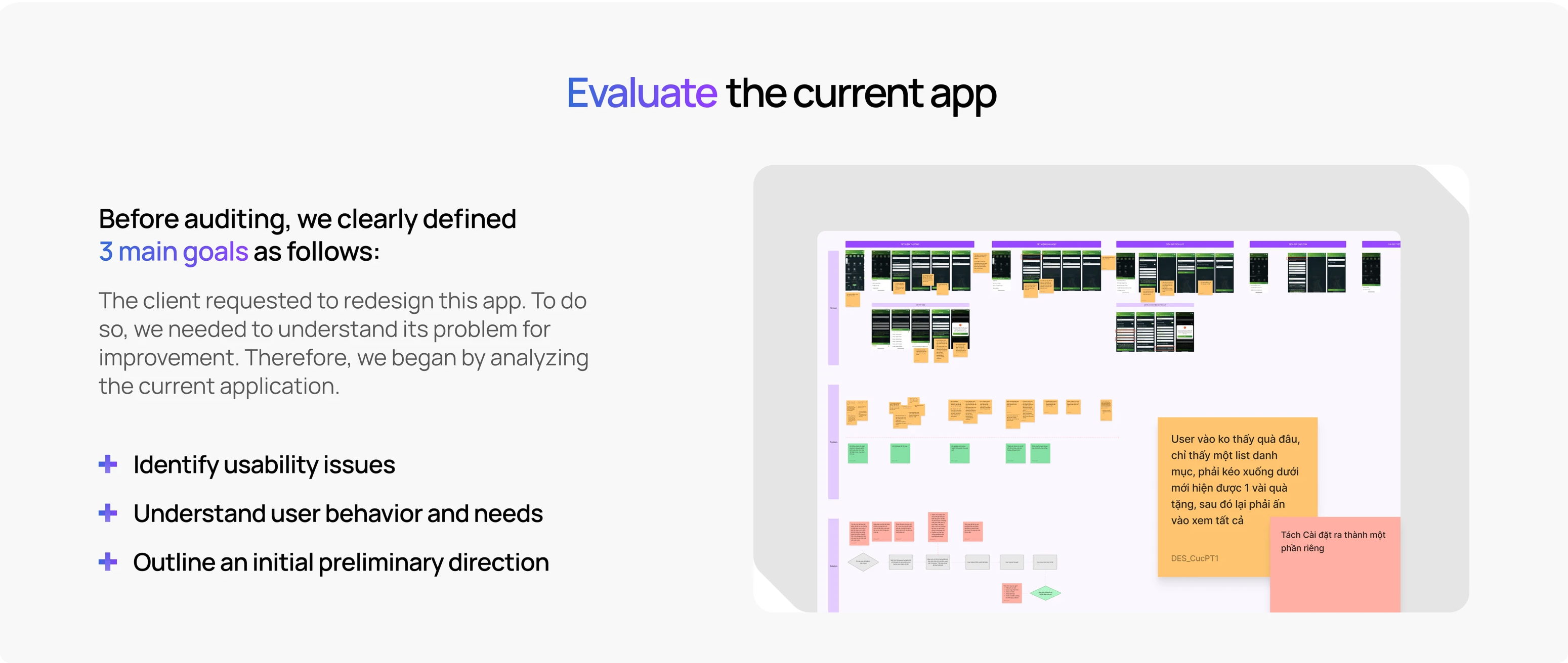
Project Objective:
Revamp the UX/UI for Vietcombank’s digital banking app—one of Vietnam’s leading public banks. This is the most significant update since VCB Digibank first launched in 2020, featuring a completely redesigned interface and user journey tailored for different customer segments, along with new services and utilities introduced for the first time.
Client Requirements:
Deliver a personalized experience for each customer segment, with a design that embodies a luxurious and modern aesthetic, setting it apart from other banks. The goal is to position Vietcombank as a pioneering leader in Vietnam's digital banking landscape.
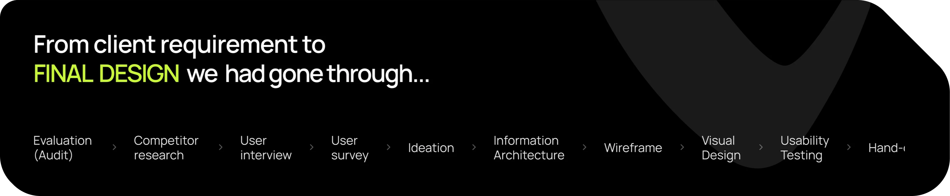
Evaluate the current app
Competior Research
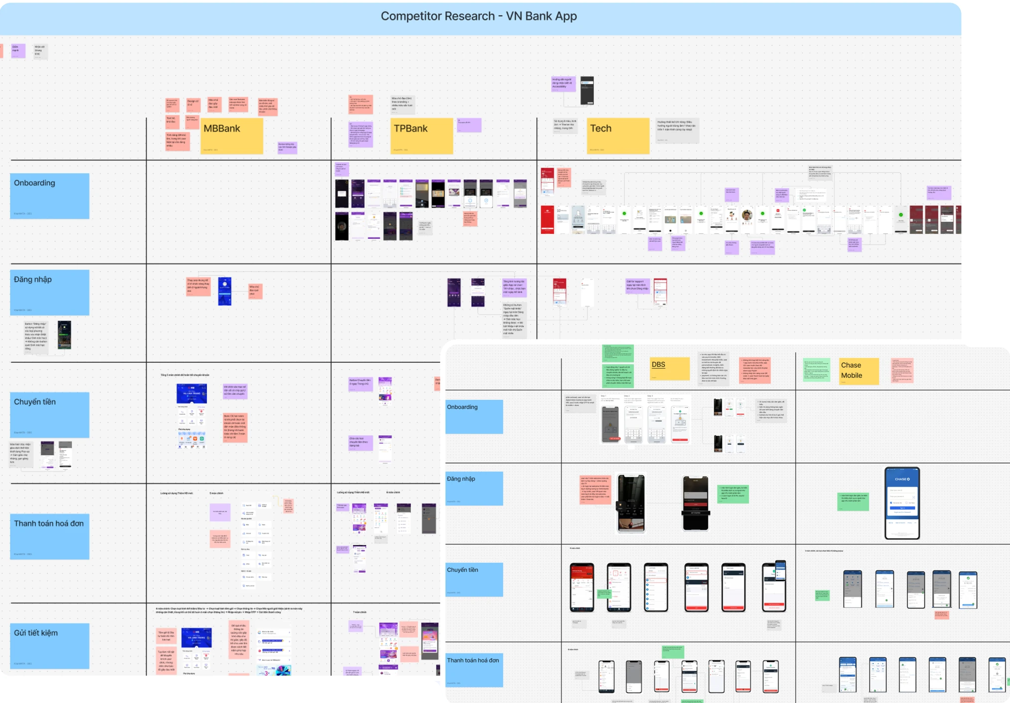
We conducted competitor research at both the local and international levels.
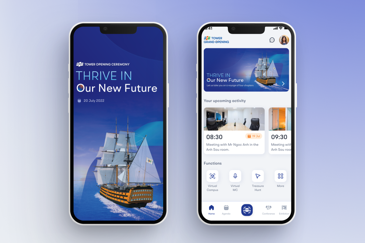
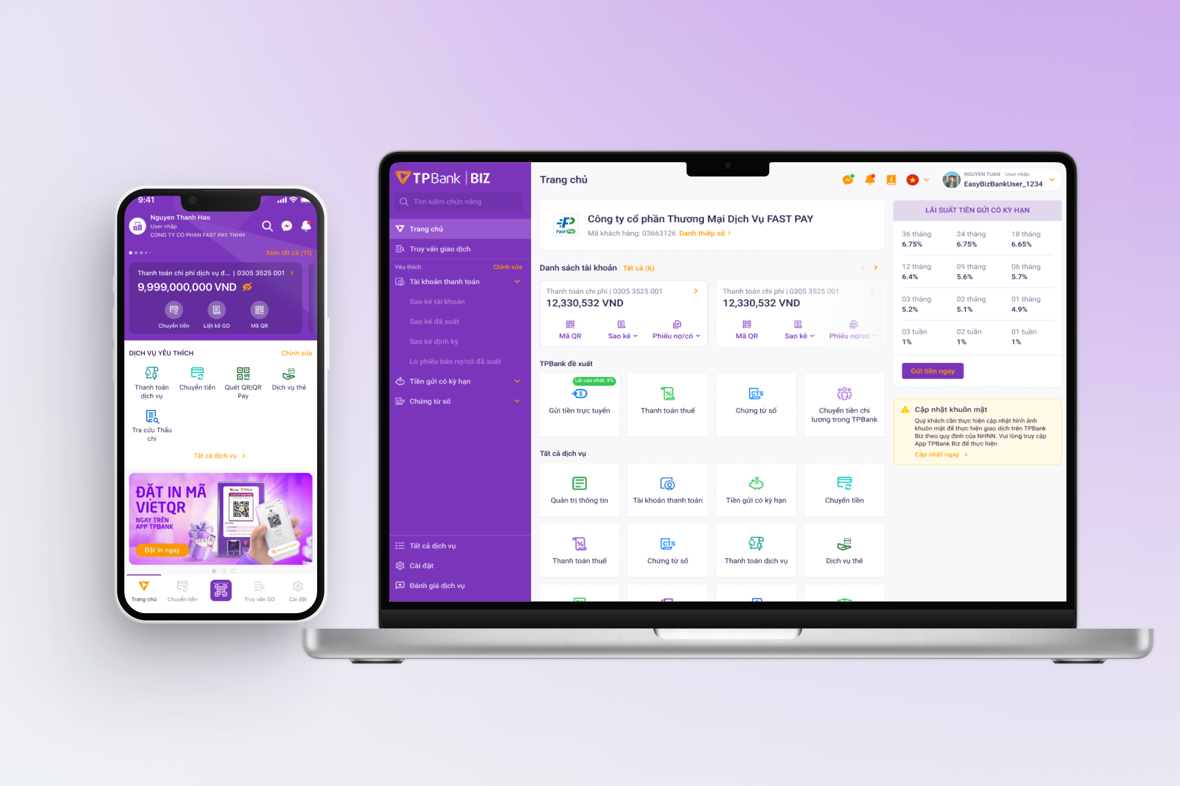
In the Vietnamese market, we analyzed digital banking apps such as TPBank, MBBank, BIDV, and Techcombank. For international benchmarks, we reviewed platforms from DBS, Citibank, HSBC, and Chase Mobile.
The research focused on evaluating feature flows to compare with Vietcombank’s existing app, identifying opportunities for improvement, and extracting relevant insights to tailor solutions that fit our product context and user needs.

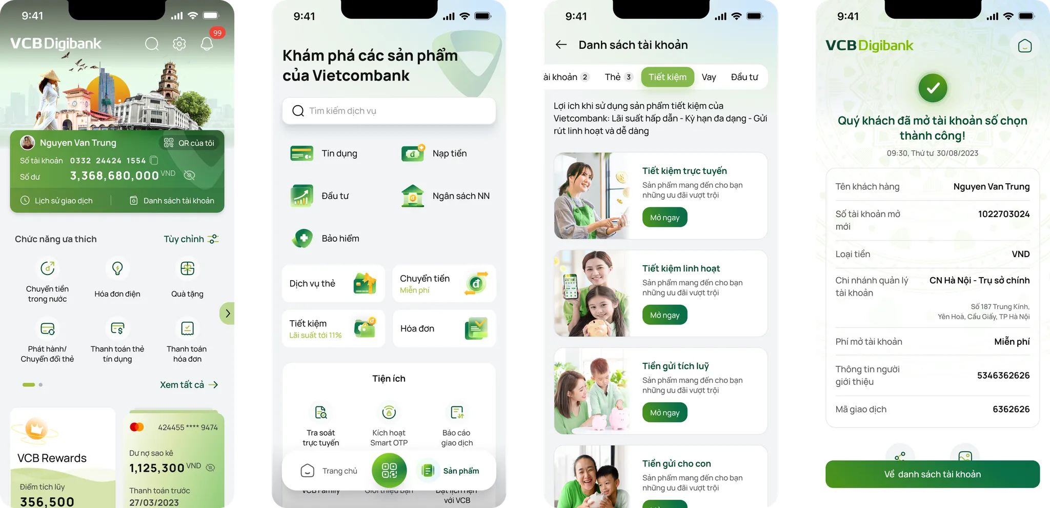
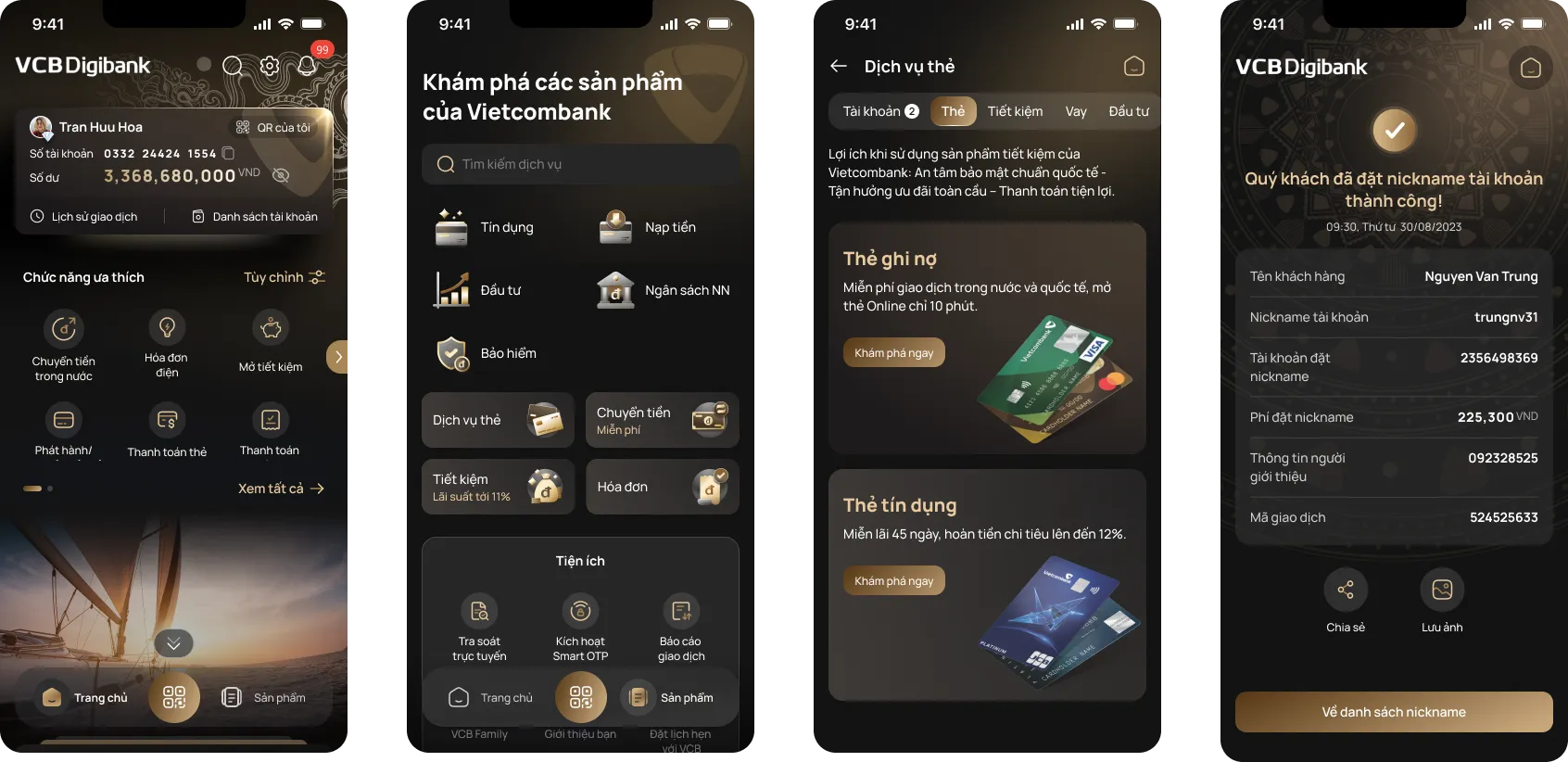
Concept: Functionality & Design Style
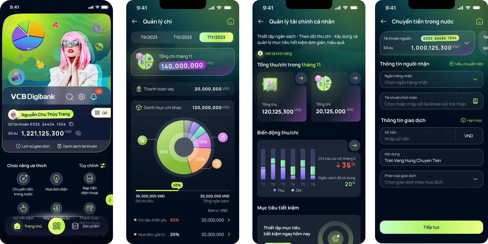
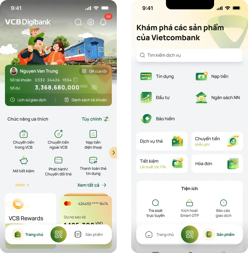
Inspired by the concept of a smart home, the new-generation VCB Digibank emphasizes personalization and seamless usability. The experience is designed to help users access familiar features with minimal effort ("low-touch"), while also encouraging them to explore and engage with Vietcombank’s diverse range of services through intuitive touchpoints along their journey.
A unified platform with customized interfaces and user experiences for different customer segments ensures consistency while catering to individual needs.

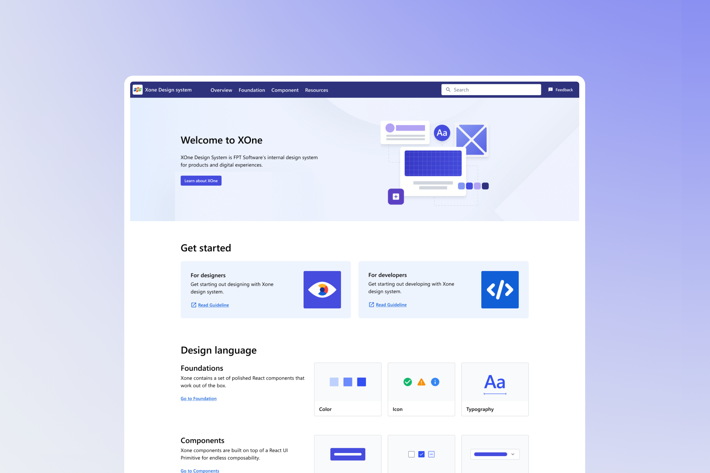
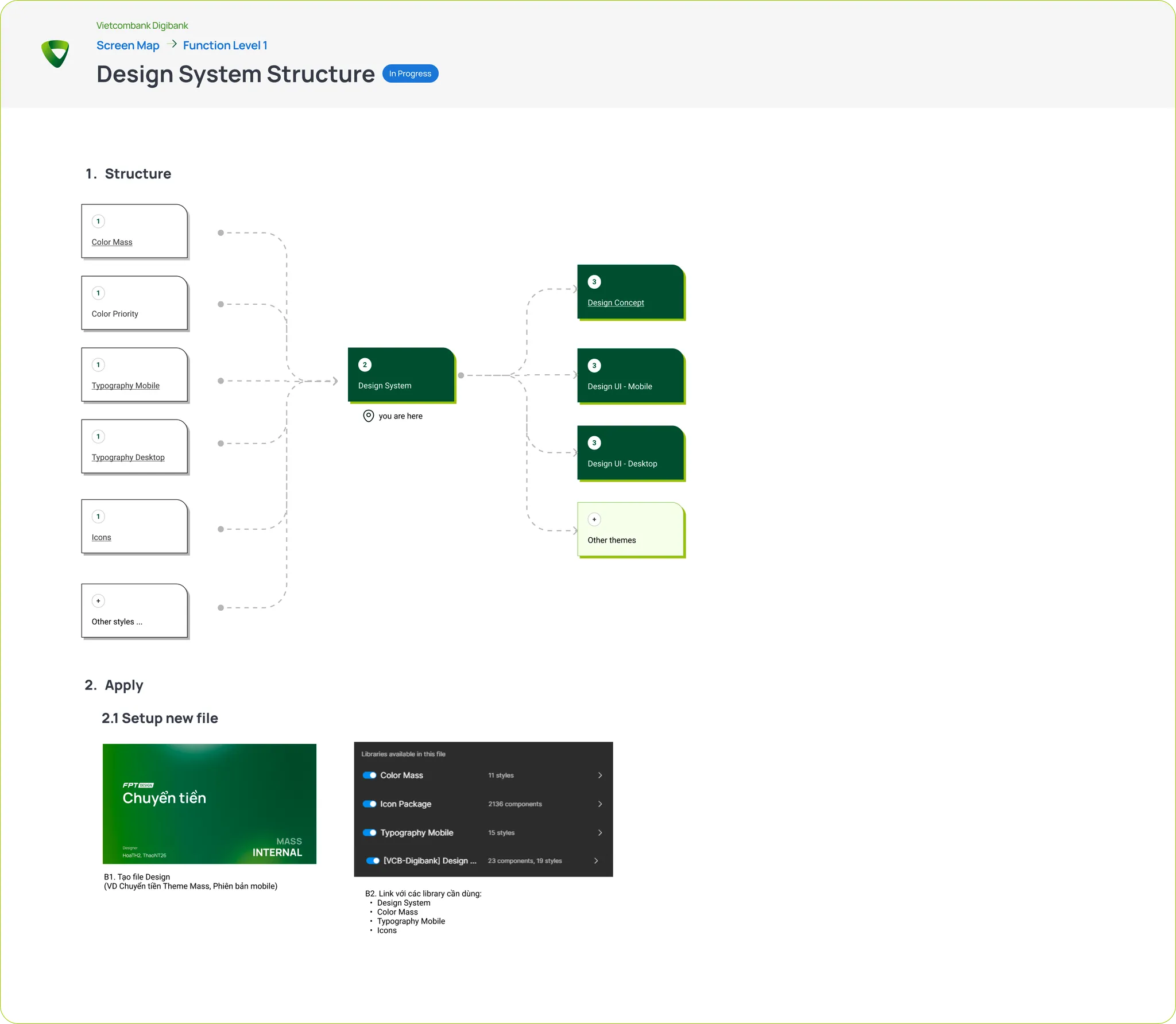
Design System Structure
With multiple themes (5) and two device versions, the risk of confusion, lag, or style conflicts is high. The Design System must ensure ease of use, consistency, and minimal errors when working across different themes and devices.
👉 Solution: Break down the Design System into modular components and only import the necessary elements into each corresponding design file. This approach improves efficiency, maintainability, and clarity in the design workflow.
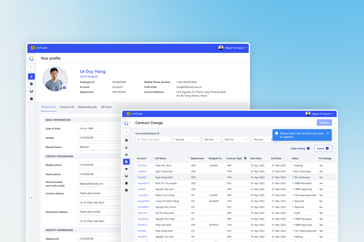
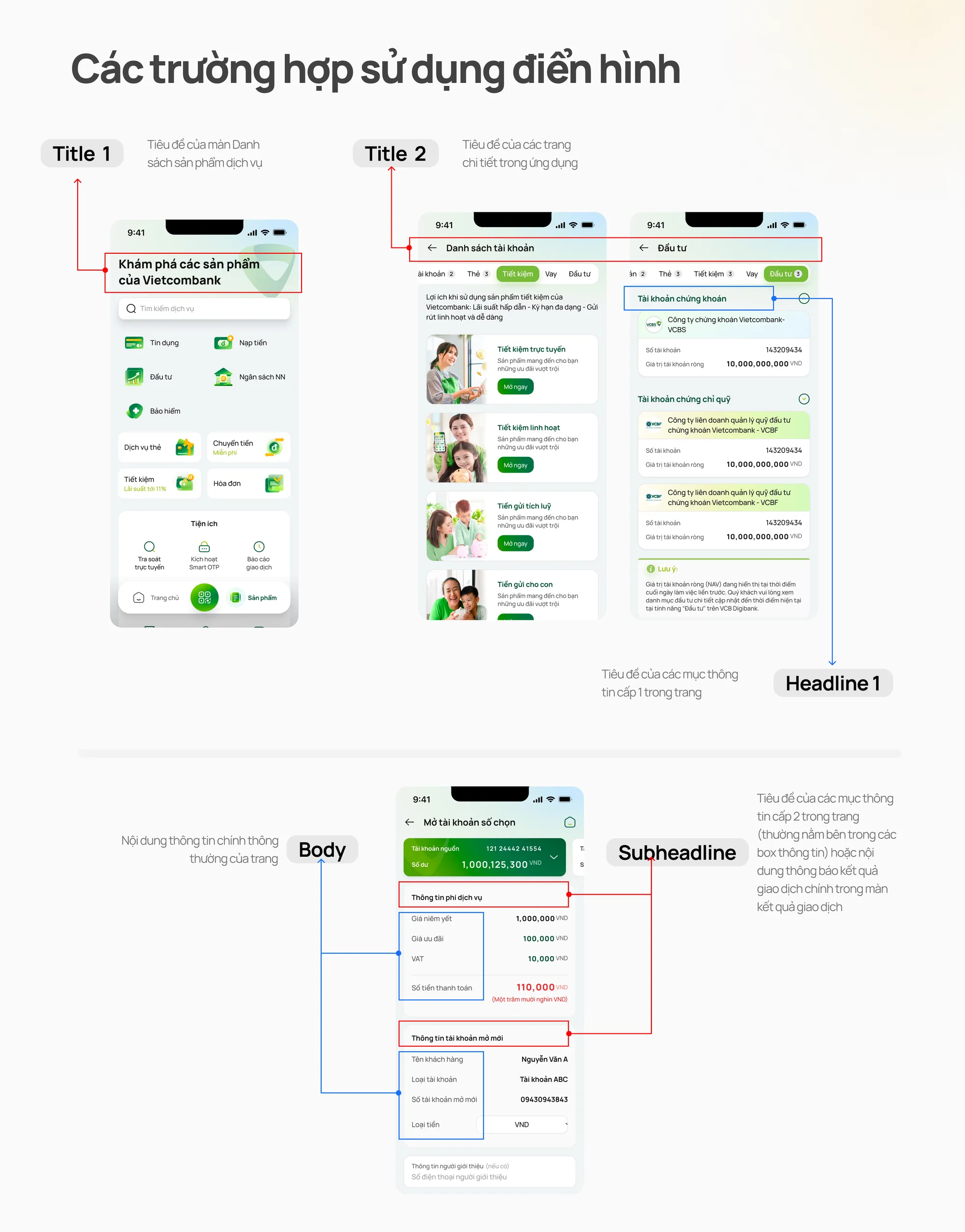
Template & Guideline
We work closely with the banking business team to establish a standardized template for common screens and provide a clear guideline for developers. This ensures consistency, accuracy, and efficiency throughout the design and development process.
.webp)
Icons
Brand personality guidelines are used to define the mood & tone for designing illustration icons, ensuring they align with the overall visual identity and user experience.
.webp)